Bookslut revealed the Best Book Covers of 2006. But, just as Sherlock Holmes has Moriarty, just as Doctor Who has the Master, and just as that 1040 tax refund has an overwhelming amount of paperwork, so too does the publishing industry have its bastard stepchildren.
Behold! Here are the worst book covers (often for perfectly worthwhile books) for 2006.
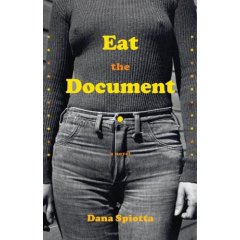 Eat the Document by Dana Spiotta: Bad enough that we see a monochromatic image of a woman clad in a sweater and jeans that tells us absolutely nothing about the book. (Is this an academic response to Our Bodies, Ourselves or a novel?) But that horrid yellow text, intended to capture the wretched typographical triumphs of the 1970s, causes this eyesore to be a classic case of a book being unfairly discriminated against by its cover. No wonder this fantastic novel didn’t sell so well earlier this year. Thankfully, the paperback version has a much better cover.
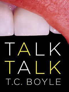 Talk Talk by T.C. Boyle: I don’t know about you, but nothing gets me more interested in reading a book than seeing an extreme close up of a mouth, complete with a pink saliva-drenched gum and a slightly offset tooth. The book’s title appears in the mouth’s cavernous onyx, suggesting to the reader that she will be eaten alive. But since there is no lower row of teeth here, how can the reader be sure of this? And what’s with the intermittent yellow text? Will the reader catch gingivitis? Is there any significance to the letter A? Or does the A stand for Ass? This is another good book marred by a gormless cover.
 The Company by Max Barry: A glazed donut, per se, is not necessarily a bad thing, except of course when a photographer is foolish enough to get an extreme close-up of its transfat gooiness (complete with drop shadow!), the white frosting and oil revealed for its sickening nature courtesy of reflective light. What’s even more abysmal is that some unknown figure has taken a bite out of this disgusting donut. If I wanted to be reminded of the dark side of human gluttony, I’d spend the day at a Dunkin Donuts watching people deposit their spoils. This is a sickening cover. The photographer should have just hired a drunkard to spew into a bright red bucket. (You’ll notice too that the first three covers listed here use variants of yellow, little realizing that this hue is a hopeless choice unless you’re a really good designer.)
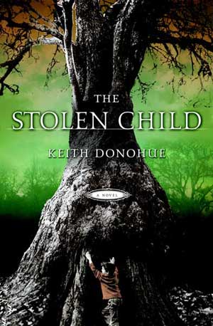 The Stolen Child by Keith Donohue: Hello Mr. Tree! Please be my friend! I’m stretching my arms in the air! Or not. Maybe I’m trying to wrap my arms impossibly around your great trunk? I really don’t know, but I’m sure the cover designer knows! Because there’s apparently GREAT IMPORT in my strange juxtaposition. But never mind me. You, Mr. Tree, are the reason why people should buy this book! You’re big and you’re strong and you’re gray! Really, really gray! Never mind that your size is outright preternatural or that you’re cast against a puke-green skyscape that will keep me off key lime pie for the next six months. This is a fairy tale! A fairy tale that must mean something.
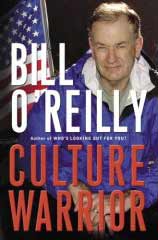 Culture Warrior by Bill O’Reilly: Nothing says “this man means business” than a constipated-looking Bill O’Reilly dressed in a blue hoodie, with O’Reilly’s tousled hair (or what’s left of it) suggesting that the man’s recovering from a weekend bender at a ski resort. But in case you weren’t convinced of O’Reilly’s seriousness, there’s an American flag to his right. And in case you weren’t aware that this was a book about America, there’s red and white text, with the red text clashing horribly against the background photo.
Dishonorable Mentions: Richard Ford’s The Lay of the Land (blue as far as the eye can vomit!); Kiran Desai’s The Inheritance of Loss (would it have killed the designers to consider text legibility?); and Richard Dawkins’ The God Delusion (a conceptual failure reminiscent of Minoru Yamasaki’s lifeless contributions to architecture).
© 2006, Edward Champion. All rights reserved.
Shame, because in my opinion COMPANY was one of the best books of the year.
The Worst Book Covers of 2006…
Bookslut revealed the Best Book Covers of 2006. But, just as Sherlock Holmes has Moriarty, just as Doctor Who has the Master, and just as that 1040 tax refund has an overwhelming amount of paperwork, so too does the publishing industry have its bastard…
Honestly, I thought the Bookslut picks were actually some of the worst covers of the year. The McSweeney’s was a parody of something that’s already a parody. (A bit like Spaceballs parodying Star Wars.) And this minimalist trend in book design is generally an excuse for rewarding mediocrity.
JeffV
But Dawkins’s cover was just so, y’know, shiny! I thought it was…divine.
OK, the type on the COMPANY cover pretty much sucked, but I read the book on the strength of the donut (oh, and the flap copy…) and I felt amply rewarded. Pretty darned funny and the visual — as you’ve perhaps surmised — was an apt metaphor. Don’t think I would have picked up any of your other choices, nor any of Bookslut’s picks.