At the bottom edge of every beer bottle, you will find a series of dots — a crude glass Braille identifying the specific glass moulding. If you examine your medicine cabinet and your building is old enough, you may find a tiny slit that once held razor blades. If you have lived long enough, you may remember when the capsules on jars and bottles were once made of lead or even cork (before health regulations replaced these with plastic and aluminum foil).
 The octagonal STOP sign, which is well-known throughout the United States and more observed than the above items, is only fifty-five years old. The eight-sided seed was planted in Mississippi by a three-man crew insisting on different shapes for disparate signs. Why this trio made the jump from four sides (rectangle) to eight sides (octagon) is an answer just as mysterious as the chopped diagonal ends on the paper in Battlestar Galactica. (It is a sad indication of our largely non-inquisitive culture that even fanboys have not sought to grill Ronald D. Moore on this omnipresent observation.)
But in 1935, the original STOP sign was yellow and octagonal, with red or black letters cast in the same font we know today. Two decades later, the yellow was changed to red. Doug Lennox’s Now You Know: The Book of Answers suggests that red “was logical because red had symbolized danger for thousands of years.” But this is too pat an explanation. A gentleman named Eric Reiss opines that the color code established by traffic signals beckoned the need for visual standards and conformity. My own theory is that the old STOP sign resembled an overripe banana, and made numerous aesthetes (and possibly a few vicars) vomit. Perhaps the yellow background caused automobiles to advance faster past a crossing to avoid the sign’s dreadful color, and this movement to avoid ugly signs was initiated in California, thereby bringing the phrase “California stop” into our national vocabulary. But I have only speculation and wild imagination to bring to this discussion. I remain convinced to this day that John Montagu took credit for the sandwich by swiping the idea from a culinary innovator stressed out in the kitchen. But, of course, nobody can prove it. If only the sandwich had emerged a few centuries later, when recording devices had become ubiquitous. Or maybe we’d rather not ask these questions.
In the case of the STOP sign, I’m sure there are public records to sift through. There may even be a transcript from some MUTCD meeting. A search for books on traffic signs reveals that most of them can, in fact, be found in the children’s section. We’re quite willing to document the signs around us, but we’re not willing to get our hands dirty and uncover the stories behind the signs. We’re not willing to encourage children to find answers to these questions. We accept their constant questions of “Why?” as an indication of a phase. The inquisitive impulse is discouraged and permitted to die. The great hoarding of money, needless trinkets, and Babbitt-like sinecures begins with two decades of education, and the world of facts, imagination, and ambiguities — that magical and less competitive realm as limitless as Schläfli — is thrown into the dust heap.
When you see a STOP sign, do you simply accept it? Or do you ever ask yourself, “Why this polygon above all others?” Is it selfish to disseminate an idea or to suggest to another person to get lost within this second concern? When I promulgated a playful riddle on Twitter yesterday, a narcissist by the name of Tony Hightower, who purports to “make stuff up for other people’s benefit,” responded, “I don’t get it. I’m too busy to understand you and your arcane obliquenesses, anyway.” I have the feeling that he simply accepts the STOP sign, and I feel sad for him.
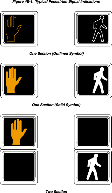 I’ve long wondered why the hand and man symbols — resembling some vaguely international semiotics — replaced the WALK and DON’T WALK blinking signs on crosswalks. This