 I’ve long wondered why the hand and man symbols — resembling some vaguely international semiotics — replaced the WALK and DON’T WALK blinking signs on crosswalks. This 2003 New Yorker article by Nick Paumgarten covers the switch — at least, as it went down in New York. At some point around 2000, it was decreed that all 85,000 signs — at the cost of $28.2 million — would be replaced. And while Section 4A.02 of the Manual on Uniform Traffic Control Devices outlines the specifics, nobody has thought to ask why the bright red hand (known officially as the UPRAISED HAND) and the white man (known officially as the WALKING PERSON) were settled upon. Were there boardroom battles? Were there numerous drafts? Were there competing designs? Was there one brave revolutionary who defied the pencilnecks in the Federal Highway Administration and had greater ideas than the hand and the man?
Here’s why I’m so obsessed by what we now all accept as real. This morning, while walking home from breakfast, I examined the white pixels located where the WALKING PERSON’s elbows should be. Even accounting for the optical liberties of pointillism, there was no elbow!
Now you may find this to be somewhat pedantic. But when most people walk, they generally use their elbows in some sense, because of this crazy little thing called gravity. And this WALKING PERSON — presumably named PERSON to avoid any controversies on the gender front — that I observed did not — repeat, not — appear to have any discernible elbows! Thus, if the PERSON was truly WALKING, would it not be strutting in representative form like a dutiful mack daddy, thus conveying to pedestrians that now was the time to get down and perambulate against the traffic?
Given that the UPRAISED HAND is a strong visual approximation of what a hand looks like, one wonders why Brooklyn thought that it should skimp out on the WALKING PERSON component of a universally mandated symbol.
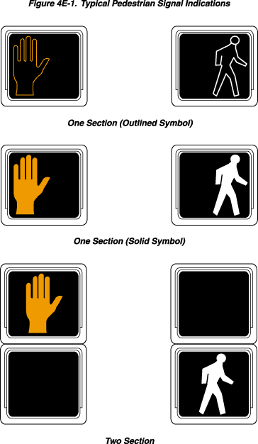
But observe the diagram on the right. We see a clear elbow! And not only that, but observe the notable gap between the ring finger and the pinkie in the UPRAISED HAND! This graphic was culled from an Oklahoma site which freely disseminates an HTML version of the Manual on Uniform Traffic Control Devices, 2003 Edition with Revision No. 1 Incorporated.
So the question becomes far more compelling — predicated perhaps on a battle between city and state and federal government. Can the federal government live with the non-deployment of the gap or the non-deployment of the elbow? And why, in turn, does it bother me that the gap and the lack of elbow does not grace Brooklyn pedestrian signals? Does this mean that I am secretly some conformist pencilneck? Should I be the strapping young bureaucrat who demands better than a flashing red hand? Or does my visceral reaction come from being pushed around for so long by a government that purports to represent us? None of us certainly had any say when the Manual on Uniform Traffic Control Devices was concocted. Was there some period of public comment when the WALKING PERSON and the UPRAISED HAND were unveiled?
Let it not be said, however, that the MUTCD is entirely without leeway. Did you know, for example, that the UPRAISED HAND can be flashed at a rate of no less than 50 and no more than 60 times per minute? I can imagine city supervisors getting into fierce arguments. “Dwayne, you heartless bastard! At this intersection, we’re going to need a greater sense of urgency! 59 or 60 times a minute! Not a flash less!”
Even more interesting, there’s this option:
An animated eyes symbol may be added to a pedestrian signal head in order to prompt pedestrians to look for vehicles in the intersection during the time that the WALK signal indication is displayed.
I have not, as of yet, seen these mysterious eyes. But there may, however, be a reason why the animated eyes remains underused:
If used, the animated eyes symbol shall consist of an outline of a pair of white steadily-illuminated eyes with white eyeballs that scan from side to side at a rate of approximately once per second. The animated eyes symbol shall be at least 300 mm (12 in) wide with each eye having a width of at least 125 mm (5 in) and a height of at least 62 mm (2.5 in). The animated eyes symbol shall be illuminated at the start of the walk interval and shall terminate at the end of the walk interval.
Of course, none of this gets to the main point I was trying to uncover. Why the UPRAISED HAND and the WALKING PERSON? Sure, accessibility and rampant illiteracy may have forced cities and counties to swap four-letter words for symbols. But how did they settle upon these two symbols?
This, alas, is a complicated answer that will require a zealot-like determination. And I hope to fully unravel this mystery in the near future.
© 2007, Edward Champion. All rights reserved.
I always did wonder what the beginning of madness looked like. Thank you.