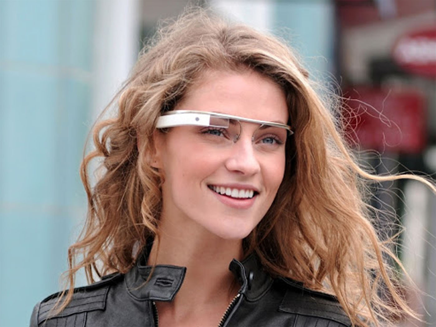
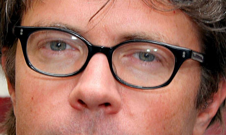
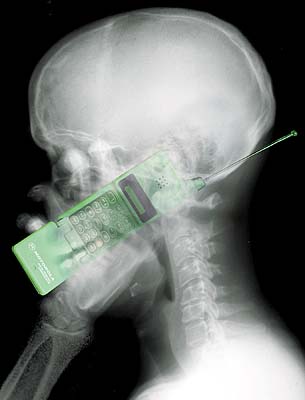
Google Glass is a snazzy set of specs that will part the Red Sea if you tap it from the right angle. It aims to fuse smartphones and computers into a hands-free user experience more pleasurable than sex, religion, and world domination combined.
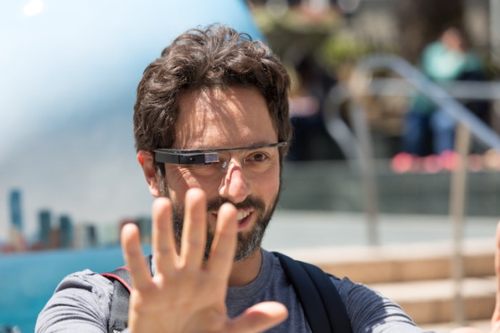
Glass is not yet on the market, but the news of its existence cut a hew through Mountain View with the strident fife of an unpaid piper wooing unsuspecting kids into a dark cave. It inspired Google co-founder Sergey Brin to publicly announce that he felt less male with the thick tools that came before. Some wondered why Brin didn’t just hold hard to his smartphone and slam down shots every Friday night like the rest of America. But when your net worth is $23 billion, different rules apply.
Brin was good enough to describe his new instrument to the Wall Street Journal last September:
They are, uh, a new form of computing, uh, that’s designed to really free you. So you’re hands-free. Uh, you know, your eyes are free. Your ears are free. Uh, and yet you can do, uh, many of the things that you might typically expect a computer or a mobile device to do. Uh, whether it’s taking pictures or video or getting messages or navigation. Uh, all those things are available.
The glasses are not now available to the general public, but Google informed The Verge a few weeks ago that the specs would cost “less than $1,500” when hitting the stores, which is believed to be sometime next year. Last month, Google offered an Explorer Program for “bold, creative individuals” who longed to test the device. Some people wearing early Glass prototypes began making bold and creative appearances in San Francisco Bay Area bars and restaurants, keen on “exploring” territory already inhabited by humble regulars. They were not received with the bountiful benisons that their algorithms predicted. As a man named David Yee put it on Twitter:
I put forth the modest proposition that Google Glass, conjured and constructed and conceived only in terms of “cool” and propped up by ostensible “journalists” who have never thought to question Mr. Brin’s brilliant PR, could pose more problems to our world than any digital invention we have seen in some time. Contrary to Mr. Brin’s suggestions, his device will not “free” us. It will quite possibly destroy several vital qualities of life we now take for granted, preying upon kind and decent and hardworking people who are still playing pickup from an economic blitzkrieg in which they had no power, little hope, and no control. One would think that a man born in Moscow under Brezhnev would grasp the cruel irony of being directly responsible for an entirely new set of encroachments upon freedom and human possibility. On the other hand, great hills of money often move mountains in other ranges.
Here are thirty-five arguments against Google Glass:
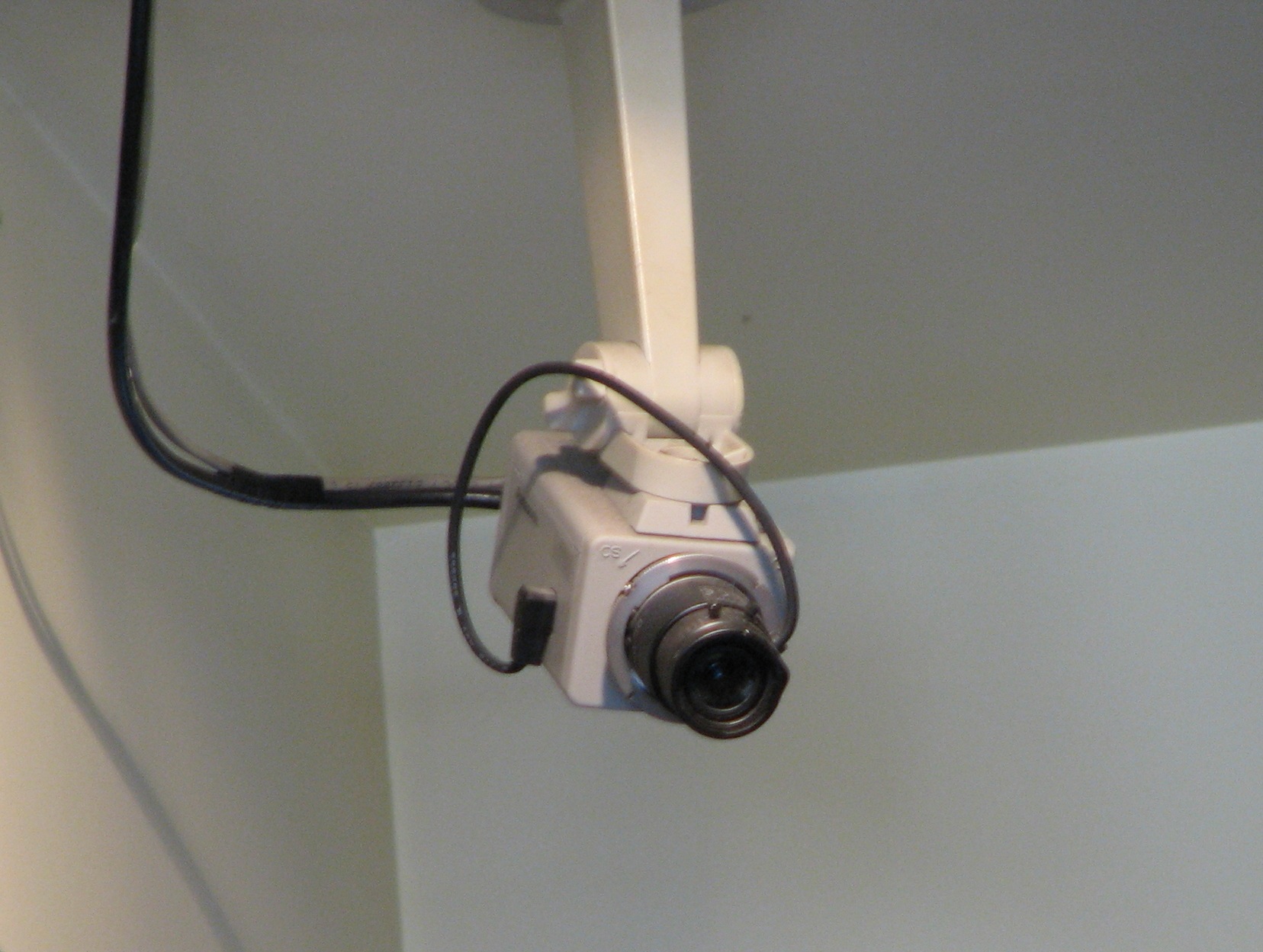
It could destroy whatever shreds of privacy we have left.
This is the greatest criticism against Google Glass. So let’s look at this in terms of law. If present terms are not refashioned by Congress in the next year to meet the realities of 2014 digital life, Google may be helped by current law, which may not protect the American public from the “electronic communications” of video recorded from a pair of glasses and uploaded to Google. The Stored Communications Act, drafted and legislated in 1986, was put into place well before webmail, social media, and cloud computing were realities. And until the SCA is updated by legislators to reflect today’s world, it remains possible that a Google Glass video — if it is defined as an “electronic communication service” comparable to email — will remain unprotected because of how the SCA now defines “electronic storage.” (See these recent cases for the present state of affairs, including Jennings v. Jennings, in which the South Carolina Supreme Court ruled that accessing another person’s email doesn’t count as a violation — even when the other person correctly guesses the email account’s security questions. But see also Viacom Int’l, Inc. v. YouTube, Inc., 253 F.R.D. 256, 258, 264 (S.D.N.Y. 2008), in which a court defined YouTube as “remote computing service” — the counterpart to “electronic communication service” — without supplying a reason.)
Metadata may create more headaches. As Mark Hurst has suggested, not only is it likely that the Glass videos will be uploaded to Google’s server, but “all of the indexing, tagging, and storage could happen without the Google Glass user even requesting it.” It’s possible that Google could introduce a service in which privacy could turn into a lucrative sideline where someone pays a premium not to be videotaped or photographed or indexed. Imagine a scenario in which Google, having rejiggered our present expectations of privacy, is further allowed to profit from the amended definition. Having already disrupted cities and widened the digital divide with the infamous Google Bus, this ungentle giant is poised to shatter our world further with Glass.
ARGUMENT TWO
It will turn the United States into a surveillance state.
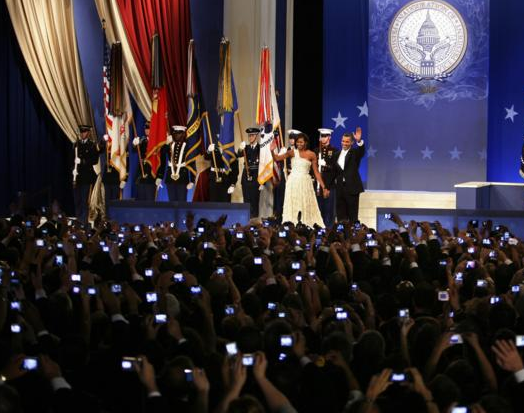
Forbes‘s Kashmir Hill was the first to observe this. But as seen in the above photograph, taken from the Youth Ball on Obama’s Inauguration Day on January 20, 2009, we were already on our way there. In just under six years, an entire generation has trained itself to take a photo with a smartphone rather than stand awestruck before mighty events unfolding.
But what if you could record and save every moment? And what if all this information could be used to incriminate other people? As Hill pointed out, Google Glass will deracinate the Young Turk’s privileged regret of not being able to jerk out her phone in time to capture a moment once called Kodak. Soon, with a simple voice command and a pair of glasses, the Young Turk can saunter up to two regular people having loud sex in a car, memorialize this private moment through video, and upload it to the cloud in an instant. Who cares if the video goes viral and these people lose their jobs? Who cares if you live in a small town where homophobia is rampant and the two taped people share the same gender? For many using Google Glass, this shutterbug roundelay will be about the lulz. But the lulz won’t sting nearly as much as the more disturbing prospect of civvies ratting out neighbors they don’t want to talk to sinks into our national psyche. McCarthyism will feel charmingly quaint by comparison. A proud nation of incognizant spies won’t have any trouble filling up the information coffers inside that massive data center that the NSA has almost finished constructing in Utah.
It will hold more people needlessly accountable for easily pardonable activities.
According to a CareerBuilder survey last year, nearly two in five companies used social networking sites to screen potential employees. Drinking, using drugs, and posting “provocative” or “inappropriate” material were more serious reasons not to hire someone than clearly vocational concerns such as poor communication skills and badmouthing former employers. In 2011, a Georgia teacher was fired for posting a Facebook photo. The crime? Holding a glass of beer in one hand and a glass of wine in the other. So what will happen when Glass lathers up more videos offering more rabid opportunities for vengeful people to be offended? Will an entire subculture emerge in which creeps sift through a person’s Google Glass oeuvre looking for the one soundbyte that will go viral and destroy that person’s reputation? As more technology enters our lives, we have become more beholden to an unreasonable ideal. We’ve seen how employers humiliate prospective employees with endless interviews because they crave perfection, but a culture that does not allow people to make mistakes cannot possibly know and feel what it is to be alive.
It is remarkably easy to steal a pair of glasses.
Just ask the guy who stole Jonathan Franzen’s specs three years ago. We have seen how laptops, smartphones, and tablets were pilfered prolifically during early adoption. (In fact, nearly half of all robberies in New York during 2011 involved smartphones and tablets.) But consider how effortless it is to snatch a pair of glasses from a person’s head. If the Google Glass user is lost in the moist miasma of a fresh fix, then there’s a good chance that his perspective will be quite removed from what’s happening in the real world. This allows the criminal to grab the glasses and run, with little time for the Google Glass user to acclimate to unlayered reality. By the time the Google Glass user has deduced that he has been fleeced of his high-end eyewear, the criminal has greatly outpaced him.
Because the specs are worn on the outside of a highly visible part of the body, Google Glass is more vulnerable to theft than a purse or a wallet or a smartphone. And if the Google Glass user has shared considerable personal information, then the prospects for identity theft are quite promising. Once criminals work out the kinks, this type of crime could prove more lucrative and high-speed than credit card skimming. And if someone repeatedly has her Google Glass specs stolen, can Google continue to take the financial hit of replacing the glasses? With Google Glass retailing close to $1,500, this may open up a new insurance business which extorts the Glass user. Will certain neighborhoods become too “high-risk” for prospective Glass applicants? Mr. Brin’s price point doesn’t exactly signal a commitment to egalitarianism.
So what of pragmatic security measures? I highly doubt that the myopic utopians basking in Glass’s technological empowerment will take kindly to a vulgar chain attached to the specs. It could remind them of a greasy key with a heavy brick unlocking a dingy gas station restroom. What we do know is this: in its present form, Google Glass will be as easy to pluck from a stranger’s noggin as a clown nose.
(It’s also possible that Glass will include some form of remote administration to protect against threat. But this may also create problems. See Argument Twenty-Two.)
ARGUMENT FIVE
It gives Google far more personal information than it needs to know.
According to Google’s privacy policy, this is what Google now collects from you:
- details of how you used our service, such as your search queries
- telephony log information like your phone number, calling-party number, forwarding numbers, time and date of calls, duration of calls, SMS routing information and types of calls
- IP address
- device event information such as crashes, system activity, hardware settings, browser type, browser language, the date and time of your request and referral URL
- cookies that may uniquely identify your browser or your Google Account
- location information
- device information
- any personal information you give Google (emphasis added)
Now this is just what Google gets from browsers. And this is the list that arrived just after Google changed its privacy policy in March 2012. The aim was to collect deeper information about its more than 1 billion users. There was, of course, no way to prevent Google from combining the personal data it collected through the many services offered through many devices. Much of this, of course, has been used to recalibrate advertising. But if Google has more data it can mine from you (that is, personal information that you “give” through Glass), and the Google Glass user is constantly recording her life and adding heaps of personal info that advertisers will want to know about, a Google user’s personal dossier will become highly cultivated indeed.
Google has a very poor history of sympathizing with people who don’t want their personal information shared. Forget that these users have very principled reasons for staying anonymous. But as far as Google is concerned, quiet lives don’t contribute to the hard profit line. In December 2009, then Google CEO Eric Schmidt barked to CNBC, “If you have something that you don’t want anyone to know, maybe you shouldn’t be doing it in the first place.” If this remains Google’s philosophy in 2013 (without Schmidt), then will this corporate sentiment apply to Google Glass?
We are dealing with a company that casually collects as much personal information as it can about its users without always informing them. Look no further than this FCC report from last year (PDF), which describes how Google’s Street View vehicles picked up “payload” data — that is, email, text messages, Internet usage history, and other personal information — between May 2007 and May 2010 while performing “location-based services.” Not only did Google collect 200 gigabytes of payload data between January 2008 and April 2010, but Google transferred it all to a data center in Oregon. (This privacy breach case was recently settled for the paltry sum of $7 million.)
So how much payload data will Google Glass collect? And what will the user agree to when signing up for the headset? If data limit isn’t an issue and Google employees are incapable of respecting privacy even on a subconscious level, what brave new metadata will be fed into Google’s data centers?
ARGUMENT SIX
It will open new possibilities for online sexual extortion.
Last year, we were introduced to Hunter Moore, declared “The Most Hated Man on the Internet” by Rolling Stone for publishing compromising photos sent in by embittered ex-lovers. Moore would humiliate the women in these images by posting the full name, city of residence, profession, and social media profile. He deemed what he did “revenge porn.” At the height of Moore’s success, his website earned him $10,000 in monthly ad revenue. There was also the vile Craig Brittain, who collected naked pictures of ordinary people and charged $250 to remove the photos. These are two very public examples of online sexual extortion, an atavistic practice which has caused countless women to be harassed. Consider the sextortionist who blackmailed 350 women to strip through Skype.
Contrary to Jeff Jarvis’s risible suggestion that humanity does not contain “uncivilized perverts,” all this awful behavior brimmed to the top of the cruel cauldron with the technology we have in place right now. Will Google Glass’s easy and portable setup encourage some of these malicious misogynists to leave their homes and seek out these women in the streets? Thanks to Google Glass, tomorrow’s Hunter Moores and Craig Brittains will innovate new mobile methods ensuring that more women are photographed, videotaped, extorted, harassed, and brutalized.
ARGUMENT SEVEN
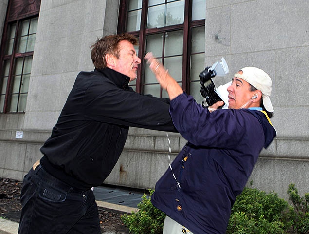
It may increase violence.
On March 8, 2013, GeekWire reported on a Seattle bar that became the first establishment to ban Google Glass. It started with a Facebook message that read: “For the record, The 5 Point is the first Seattle business to ban in advance Google Glasses. And ass kickings will be encouraged for violators.” While the “ass kickings” aspect of this message was clearly tongue-in-cheek, it does highlight one little discussed consequence of sticking an unwanted camera in someone’s face: you may get your ass beat.
The kind of violence we’re considering goes well beyond Justin Beiber threatening a photographer or Alec Baldwin getting into another paparazzi rumble. As we continue an ongoing dialogue about First Amendment rights and what photographers can and cannot shoot, cameras mounted on specs could lead to a greater distrust of the photographic form. It could lead to more assaults directed at legitimate photographers who are trying to document history. Street photographers have developed well-honed rules that take into account respect for subjects. (See also Argument Fifteen.) But when anybody with Google Glass styles himself a “photographer,” can these inexperienced types be counted on to display the same finesse? If these new “photographers” invade the privacy of subjects, will their subjects remain calm and nonviolent?
ARGUMENT EIGHT
It will discourage personal risk.
In a 2008 study, three Dutch researchers demonstrated that security cameras triggered approval-seeking behaviors. The mere presence of cameras was enough to suggest some omniscience. Another experiment in 2011 revealed how cameras discouraged 86 students from cheating. These two studies relied on clearly delineated cameras. But it does leave us wondering how risk or a free-flowing conversation will be actively discouraged when a person enters a restaurant, only to find four people sitting at tables wearing Google glasses, all recording the world around them.
(Argument Sixteen also relates to the issue of risk, discussing how artists and performers could be held more accountable for what “offends.”)
ARGUMENT NINE
We have no idea what health problems Glass will create.
Last July, Cult of Android revealed that the HTC Evo 4G, the Apple 4S, and the Blackberry Bold all exposed users to an SAR (Specific Absorption Rate) level at well over 1 W/kg. The FCC has set the maximum SAR at 1.6 W/kg. Google recently filed documents with the FCC, revealing a 1.34 W/kg SAR for Project Glass. That’s more radiation than the iPhone 4S. But unlike the smartphone, which is only placed near the head when answering a call, Project Glass will be constantly on the head. Which means that Glass users will be exposed to more constant radiation. Additionally, according to healthcare advocate Camilla Rees, companies often report SAR values differ from the real number. Will Google Glass lead to an uptick in brain cancer? In 2011, a World Health Organization report (PDF) suggested one remedy to the carcinogenic risks from smartphones: “it is important to take pragmatic measures to reduce exposure such as hands-free devices or texting.” Unfortunately, Google Glass pushes “hands-free” back to the head.
ARGUMENT TEN
It may increase violations of doctor-patient confidentiality and attorney-client privilege.
The U.S. Department of Health and Human Services maintains a list of confidentiality breaches which affect 500 or more individuals. There are presently 556 records of large scale breaches. Countless thousands have had private health information disseminated beyond the seemingly secure confines of a hospital. These breaches, in turn, cost healthcare providers money. While the HHS doesn’t lag behind tech as much as Congress does with the SCA, it has only just introduced measures four months ago to protect patients when using mobile devices. Present research indicates that only 44% of healthcare providers encrypt their devices. This leaves one to wonder what fresh hell Google Glass will unleash. Will doctors become hooked on Glass in the way that they are presently reliant on smartphones? And, if so, will the images and records that doctors collect be secure enough for the HHS? Can Google really be entrusted to protect all this data?
And then there’s attorney-client privilege. In 2009, an attorney exchanged text messages with his deponent client. The subsequent case, Ngai v. Old Navy, ruled that surreptitious text messages were not privileged under Federal Rule of Civil Procedure 30. This does lead one to wonder if an attorney who is wearing Google Glass during a deposition will be subject to similar disclosures of “unprivileged” communication.
ARGUMENT ELEVEN
It could be hacked.
In 2010, Google was hit with a highly sophisticated hacking attack from China. The hackers stole intellectual property, scoured source code, and peered into the Gmail accounts of human rights activists. Google never provided details on how Operation Aurora had occurred. And it’s safe to say that recent attacks in the past month from China demonstrate that the attacks are far from over.
But nobody appears particularly concerned about what Google will do to encrypt its new tool from vicious hackers. To get a sense of just how much bad security can smash a person’s digital life, consider the horrors endured by journalist Mat Honan:
I bought into the Apple account system originally to buy songs at 99 cents a pop, and over the years that same ID has evolved into a single point of entry that controls my phones, tablets, computers and data-driven life. With this AppleID, someone can make thousands of dollars of purchases in an instant, or do damage at a cost that you can’t put a price on.
Given how Google has erected an eclectic empire on the bones of search, what’s not to suggest that something as ostensibly straightforward as Glass will bulge with similar spectacle? Will some future Mat Honan find a video simulacrum of himself constructed from long pulls at a Google Glass feed? And will he will have to spend years of his life contesting it? Hacking typically happens because we unthinkingly keep devices on without considering how they can be invaded. As “virtualization evangelist” Mike Foley expressed in a blog post about data sensitivity, “What if I was streaming my Glass feed via a MiFi?” It’s a good question. And we haven’t even considered how News of the World-style phone hacking could develop with these new devices.

ARGUMENT TWELVE
It will discourage anonymity.
In an August 2011 blog post, Danah Boyd called “real name” policies an abuse of power. Decrying guidelines in effect at Google+, Boyd observed that vulnerable people or political dissidents were clearly at risk through mandatory outing:
What’s at stake is people’s right to protect themselves, their right to actually maintain a form of control that gives them safety. If companies like Facebook and Google are actually committed to the safety of its users, they need to take these complaints seriously.
In the aftermath of the nymwars, Google+’s policy is still highly prejudicial against pseudonyms. The only way someone can obtain a pseudonymous Google+ account is “by providing links to other social networking sites, news articles, or official documents in which you are referred to by this name.” And for someone with limited Internet access in a country with a suppressive regime or for someone who fears for her life, this policy is a needless hardship for someone hoping to pass along invaluable information to the outside world.
Why is this important? Because, in the past year, Google has been increasingly aggressive in directing users to the Google+ page. As The Wall Street Journal reported in January, some users may not be fully aware of how much Google is cross-referencing:
Sam Ford, a 26-year-old Navy petty officer, says he signed up for Google+ on his smartphone because it would let him automatically upload new photos to a Google+ folder—one that he kept private. Later, he says, he was surprised to see that his Google+ profile page—which includes his name—was tied to a software review that he wrote recently on the Google Play online store.
So Google wants to out you. It wants to make it very difficult for you to procure an anonymous account. And it wants everything you do on any of its devices — on your computer, on your smartphone, on your Google Glass — to be united publicly for anyone with enough grave tenacity to see. And even though anonymous speech is protected by the First Amendment, if you don’t abide by these terms, it’s Google’s way or the highway:
We understand that your identity on Google+ is important to you, and our Name Policy may not be for everyone at this time.
ARGUMENT THIRTEEN
It isn’t distinct enough from the body.
People were permissive of smartphones and the cameras that came before because these tools were clearly distinguishable from the body. For all my plaints leveled in Argument Two about the United States turning into a surveillance state, we can at least see that the Youth Ball partygoers are photographing the Presidential dais with discrete devices. But if we’re going to wear something, shouldn’t it communicate something back to other people? Is this not the purpose of fashion?
Enter Kate Hartman, an eccentric and affable artist and educator who has been investigating the issue of “wearable communication.” Hartman has proffered such innovations as the Talk to Yourself Hat, in which the wearer speaks into one end of a long tube leading back to his ears, and The Boundary Belt:
The Boundary Belt is provides the wearer with the ability to produce a spontaneous boundary marker in the event of an ambiguous or misconstrued situation. With a press of the emergency release button (located on the belt), the boundary is immediately launched, clearly indicating to the approaching party where they are or are not welcome.
So if Google is going to encourage rampant alienation and elitism, there seems to me a fundamental design flaw. Wearable communication needs to make a distinct and highly visible impression to count. There’s still hope, of course, that Google will equip later versions of Glass with light weaponry, turning these chichi specs into ground-level drones that will massacre anyone who hasn’t yet swallowed the Kool-Aid. Should not Glass become a fashion statement that kills on the platform? If we’re going to push technology to the limit, why not take the phrase “killer app” more literally?
ARGUMENT FOURTEEN
It could give the police far more details about you than you can possibly know.
A few weeks ago, the ACLU published a lengthy list of what Immigrations and Customs Enforcement officials were able to extract from a suspect’s smartphone. The list included call activity, phone book directory information, all stored voicemails and text messages, apps, several passwords, and 659 geolocation points. Two years ago, the Michigan State Police were reportedly using Cellebrite devices to copy the entire contents of a smartphone in two minutes. (The MSP refuted the ACLU’s claims.) But as the ACLU revealed in April 2012, approximately 200 law enforcement agencies were tracking cell phones without a warrant. (The ACLU also offers this helpful map to determine whether or not your local police department is really into warrantless cell phone tracking.)
If police departments are collecting a smartphone’s geolocation points (or other data on your phone), then what is to stop the cops from confiscating every single video that you ever made with Google Glass? (For that matter, what is to prevent Google+ from offering some Glass Archive answer to Facebook’s Graph Search?) How long will Google archive videos or make them accessible through Glass? That drunken sex video you made while you were wearing Glass could be used to incriminate your character or, at the very least, give the police some glimpses of your posterior you never thought they would see.
ARGUMENT FIFTEEN
It will discourage kindness and respect.
Sometime last year, an unidentified man began taking videos of people around Seattle without their permission and posting this to YouTube. He became known as “The Creepy Cameraman,” although he later adopted the moniker “Surveillance Camera Man.”
“I’m taking a video,” says the mumbling voice behind the camera when people ask why he’s taping them. But this is the only reason he offers as he approaches people with his camera as they are trying to have private conversations or enjoy their meals or have a quiet moment after a long day of toil. Surveillance Camera Man could be performance art. It could be some kid’s idea of Candid Camera. Whatever the case, it’s one of the most mordant commentaries on 21st century life I’ve seen in the last six months.
Surveillance Camera Man’s justification is that, because various establishments have surveillance cameras, his ground-level camera isn’t any different. And to get a sense of how dehumanized Surveillance Camera Man is (or, at least, presents himself to be), watch in the above video as he films a young woman screaming as she is being arrested near the 2:19 mark. He doesn’t ask if the young woman is okay. The young woman is there merely for his photographic non-purpose.
If this isn’t a harbinger of what Google Glass could serve up as a parallel to Kitty Genovese, I don’t know what is. We’ve already seen soldiers posing before humiliated and tortured prisoners with the Abu Ghraib photos. If, as Susan Sontag argued in one of her last essays, “the photographs are us” and brutality has come to dominate the visual and digital culture of American life, then what will happen when those who surrender kindness and respect put on a pair of glasses?
ARGUMENT SIXTEEN
Artists will be held more accountable for material that “offends.”
Last year, Patton Oswalt was called an asshole because he deigned to call out an audience member who was taping one of his new routines with her cameraphone. Despite the fact that Oswalt asked her politely to not tape his routine with her phone, she continued to do so. As Oswalt wrote:
For starters, whatever camera phone she was using had a piercing, distracting light on it which she merrily aimed right into my eye.
Worse, here’s when she started taping: halfway through a new, longer joke that I’m working on — a very embarrassing recollection from my younger years that I’m very nervous about performing and still very unsure of how to unspool. This was only the fourth time I’ve ever performed it, as well as the fourth time I’ve ever admitted this incident in public. So it still feels like a very nervy high wire walk for me. There’s times when I lose the audience and have to get them back, freeze up, and wonder if I shouldn’t have just kept this whole incident to myself. I’m walking into new territory with this one, and it’s scary and I feel very raw and dry-mouthed when I do it.
Oswalt would own up to not keeping his cool. On the other hand, if risk is essential to expression and creativity, isn’t strong opposition against those who wish to hinder creative progress the sanest possible response? What effect will Google Glass have on standup comedians or other artists? Will the performing arts deliquesce into some tepid shell of its former self because all on stage can be recorded at all times? If every moment we have is taped with Google Glass, and we know that we are always being watched, how will future artists take risks? (See also Argument Eight.) And how can art build and evolve when risk and originality is discouraged?
ARGUMENT SEVENTEEN
It may kill off what remains of the moviegoing experience.
First, there were talkers. Then smartphones disrupted the moviegoing experience. It is now almost impossible to go to a movie theater (save for the Alamo Drfthouse) without contending with bright LCDs flashing in the dark because some spectators have a pressing need to text pedantic messages during a gripping scene. Glass will push this obnoxious behavior to new levels. Not only will Glass encourage more talking (after all, some will need to multitask during a movie), but it could lead to an unprecedented wave of piracy.
It’s quite surprising that the MPAA has stayed mum about Google Glass. Because Glass threatens the film industry’s livelihood far more than a smartphone. The entertainment industry has certainly duked it out with Google in recent months over the latter’s failure to crackdown on copyright infringement. But why fight Google on torrents showing up in search results when Google is about to unleash a device that can record a first-run movie projecting on a screen at 720P?
If you’ve attended an all-media screening for an advance movie in recent years, you’ve probably encountered the wands and the peers into reticules and backpacks and the requests to check in your phones because of piracy concerns. But Google Glass will be available with prescription lenses. And what this means — especially if Hollywood wishes to enforce equally stern security at everyday screenings and Glass is the only pair you brought to the theater — is that Glass wearers could be turned away at the door.
ARGUMENT EIGHTEEN
It will create problems with consent.
Twelve states in America legally require that all parties consent to the recording of a telephone call. Most of these state laws were devised when telephones were landline only. (For example, California Penal Code § 632(a), which regulates one party consent for telephone recordings, was legislated in 1967 as the Invasion of Privacy Act.) It never occurred to California state legislators in 1967 that phones would be cordless or that conversations would occur more frequently in cafes and restaurants outside of private corded lines. Much like the Stored Communications Act described in Argument One, this is another example of legislatures simply not acting fast enough to account for rapid technological advancement.
Unfortunately, consent can no longer be regulated in the old way. In the last few months, Google asked users to permit Google Search on Android-powered phones to record audio and take pictures and video with a new update. If Google can do this with the Search app, what’s to stop Google from seizing your consent with Glass?
This goes back to the passive-aggressive ultimatum in Argument Twelve. Google realizes that waiving consent “may not be for everyone at this time.” But since Google is the one unveiling the fancy glasses, it will be more than happy to strip you of rights you didn’t know you had through a sneaky permissions acceptance.
ARGUMENT NINETEEN
Cool places will be outed by boors.
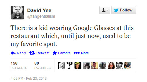
In 2010, Brent Cox wrote an essay for The Awl, bemoaning the notion of publicizing a fried dumpling joint in Chinatown that offered him a fast, delicious, and affordable way to live. Before Foursquare’s constant check-ins became a febrile pastime practiced by wired youth too taken with tagging and before Yelp unleashed a ceaseless horde of would-be Pete Wells types excoriating restaurants, it was a common practice to stay silent about a happening place, lest it be “discovered” by members of the public or be denuded of charm once everybody found out about it. Cox opted to stay mum about the dumplings: a commendable decision for a Brooklynite that deserves several hugs and a few pints of lager. But for every Brent Cox, there are several dozens who will blab.
Oversharing has been thoroughly sent up by Please Rob Me. But Carnegie Mellon researchers have also used Foursquare data to pinpoint a neighborhood’s area and character. So if video information is piled atop geotagging and we continue to encourage a culture in which the Brent Coxes of our world become as rare as polar bears, it’s possible that the quiet establishment you now enjoy won’t, as David Yee tweeted above, be your favorite place anymore.
ARGUMENT TWENTY
It will discourage people from paying attention.
When a small window can pop up anytime with a “more desirable” friend, even as a friend in the real world sits before you trying to have a conversation, we have a problem. We have all experienced the phenomenon of people checking their smartphones for messages in social situations. But when Google Glass creates a new visual overlay with emails, IMs, or video messages from friends during a meal, it ushers in a new wave of continuous partial attention in our culture. The problem with this is that humans aren’t very good at multitasking. (This infographic offers some helpful stats, including the startling figure that only 2% of people can actually multitask effectively.) Multitasking costs us more time and reudUces our productivity by 40%. As Cornell professor Zheng Wang put it, “They seem to be misperceiving the positive feelings they get from multitasking. They are not being more productive – they just feel more emotionally satisfied from their work.”
Glass will probably make many people feel good, which is precisely what one expects from an alluring narcotic. But it will come at the expense of focus. Teachers will contend with distracted students as they pass along essential knowledge, even though learning and multitasking can’t work at the same time. If you’re very good at paying attention to people right now, you may find yourself an unexpected specialist in about five years.
ARGUMENT TWENTY-ONE
It will turn more strangers into stalkers.
One of Glass’s big features is the ability to track another person’s location down to the very foot. This will certainly create additional pressure for people to walk faster or be on time to social engagements, but I’m concerned about how this will encroach on our geographical privacy. Should the world really know our precise coordinates at all times? Don’t we have the right to disappear for a few hours into whatever location we desire without being hassled by some guy we politely endured at the party last Friday and who added us to his Google+ Circle before we could gently let him down? Could those who are barely acquainted with us turn into stalkers?
Before Glass, this was already a very legitimate concern. In 2010, The Daily Beast‘s Lisa Riordan Seville reported on how Foursquare inspired strangers to stalk people. Seville describes how social media strategist Carri Bugbee checked into a restaurant on Foursquare. The hostess came over to Bugbee, telling her that she had a telephone call. Bugbee answered the phone and was greeted with a male voice who found her Foursquare check-in and told her that she shouldn’t use the service because people could learn where she lived. Then he called her a “stupid bitch,” among other insults.
With Google Glass, these casual threats will be ratcheted up, thanks to heightened visual information more available to the public. Not only will a potential stalker be able to track you through your geotags, but he may be able to discover the exact table you are sitting at through another Glass feed. From all this, he could inspire his peers to deliver a full-scale assault in the real world.
After the creep called, Bugbee slept that night with the lights on. What would the creep have done if he had Google Glass to work with?
ARGUMENT TWENTY-TWO
It will create more cyberbullying and stress.
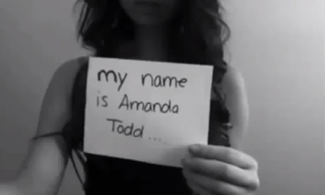
On September 7, 2012, a brave Canadian girl named Amanda Todd uploaded a video that went viral. She held up a series of flash cards to describe her experiences of being bullied. When Todd was in seventh grade, a creep asked her to bare her breasts through video chat and the creep used this to blackmail her. Amanda had turned to drugs and alcohol and suffered from depression and panic disorder because of this experience. And because the Internet is a medium that invites cruelty as it does warmth and wonder, Todd suffered more abuse through social media. She was bullied at school. A little more than a month after the flash card video, Amanda Todd killed herself.
As Ars Technica detailed in a lengthy investigation earlier this week, hackers have installed remote administration tools that permit them to spy, scare, and enslave people into doing what they want. From the comfort of his ranch home, a bitter 32-year-old paraplegic can now let his enmity devour him, using his computer to ruin the lives of teen girls. (Because of this man’s ongoing threats, one young woman didn’t leave her dorm room for a week.)
So who will Glass’s “ratters” be? Because of the theft issues I described in Argument Four, Google will have to include some form of remote administration on Glass. But RAT works both ways. And if Google can’t prevent China from hacking into its site, how will it stop hackers from taking Glass by remote?
ARGUMENT TWENTY-THREE
It could make you more willing to believe lies.
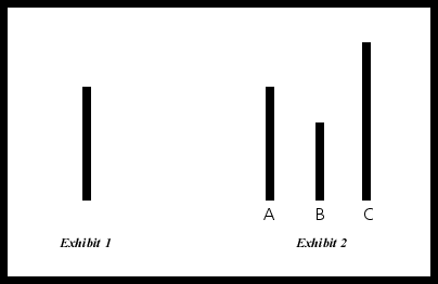
In the 1950s, a social psychologist named Solomon Asch conducted a series of experiments in which subjects were shown two cards: one featured a vertical line, the other showing three lines (one the same length as the first one). Asch asked his subjects to identify which line on the second card matched the line on the first card. But he enlisted other people to stand next to the subjects who blurted out the wrong answer. What Asch discovered was that three out of four of his subjects agreed with these incorrect answers. In 2005, Gregory Burns updated the Asch experiments using functional MRI scanners. He discovered that social conformity was rooted in brain areas oriented around perception. Five decades after Asch’s experiments, subjects gave into group pressure, with 41% of the subjects going along with the group on wrong answers.
Berns discovered that his subjects felt judgment in brain areas associated with emotion: the amygdala, which is associated with fear of rejection. In her book Quiet, Susan Cain points out that the social fear identified in the Asch and Berns experiments not only makes our world harmful for introverts, but threatens the very fabric of our culture and institutions. People who are “slow” with their opinions, who wish to think about a topic from several angles before responding, could be drowned out by the noisome crowd. And if a group can outright alter our perceptions through social pressures, then how can we stand for the truth? The question we now ask ourselves is whether Glass, which stimulates perception by adding another layer and which may encourage the user to go along with the views of those who chatter in our screen, will cause us to believe in more lies. Could Glass could prove so seductive to some that there won’t be any need to Google anything for veracity again?
ARGUMENT TWENTY-FOUR
It will create more needless distraction.
Anyone who has attended a wedding in the last five years knows how smartphones have altered the nupital landscape. Enthusiastic amateurs not only become feverish about documenting the day, but they often get in the way of the professionals. The problem has grown so large that some couples have created “unplugged weddings,” in which the bride and the groom ask their assembled guests to clamp down on their smartphone use. But what happens when the wedding guests all wear Glass? Will they all mutter “Okay, Glass, record a video” or “Okay, Glass, take a picture” at the same time and talk over a quiet moment that isn’t theirs to pollute?
And what effect will the Google Glass light, signifying that it is recording something, have on the way we revere the wonders of the dark? The recording light will have to be bright enough for us to know that someone is taping us. But if a stranger comes up as we’re enjoying a candlelight dinner with our lover or observing the beautiful stars from a dark open patch with friends, how will these distractions kill the moment? Jane Brox’s excellent book on the history of artificial light, Brilliant, describes how our inner courage has dimmed as we have craved more illumination. As Brox puts it, “The more light we’re accustomed to, the more we feel the need for security.” But what about the human security built without technology? Will focus and fortitude be so easily surrendered as we accumulate more distractions? It would seem that the people at Google watched They Live and wildly misinterpreted what Carpenter’s sharp-edged satire had to say about human awareness.

ARGUMENT TWENTY-FIVE
It will expand the Streisand effect to an unprecedented level.
In 2003, before social media and YouTube even existed, Barbara Streisand’s attorney sent a cease-and-desist letter to a website in an attempt to get an image of her Malibu home removed. This resulted in the image being distributed further. Techdirt‘s Mike Masnick called this the Streisand effect, wondering how long it would take lawyers to “realize that the simple act of trying to repress something they don’t like online is likely to make it so that something that most people would never, ever see is now seen by many more people.”
This smart observation proved especially illuminating when Trafigura issued an injunction restricting The Guardian from reporting on the oil trader’s possible involvement in a toxic waste dump scandal. The willful suppression of reported material — whether it be Trfigura or a nine-year-old girl photographing her school meals — is a cancer against free expression that must be battled at all costs.
But is there a reportorial defense for the cyberbullies and other assorted ghouls? Last month, Gawker‘s Camille Dodero revealed how a band of trolls cyberbullied a six-year-old girl with progeria named Adalia and her mother. Here’s what the ringleader had to say:
After Adalia’s passing, he said, the only online trace of her existence would be these cruel images. “You know whose fault it’s gonna be? It’s not gonna be the millions of people on the Internet who looked at them. It’s gonna be yours for letting these pictures escape,” he stammered, as if Adalia’s baby photos were leaked documents. “You are a sick woman. You are more disgusting and horrible than my fat disgusting ass could ever be.” He was nearly spitting. “You are one stupid bitch.”
The parallel that Dodero draws between “baby photos” and “leaked documents” is especially perspicacious. Journalism typically reports on something. It doesn’t resort to cheap abuse.
If this type of video vitriol expands with Glass, there could be legislative repercussions against how we express ourselves online. More likely, expression will carry on as it has before. And anyone seeking grievance could find themsleves immune from sociopathic jackals seeking vigilante-style restitution. And it’s all because of the Streisand effect.

ARGUMENT TWENTY-SIX
It could prevent people from discovering themselves.
In her wonderful book A Field Guide to Getting Lost, Rebecca Solnit was guided by a question that a student posed to her, “How will you go about finding that thing the nature of which is unknown to you?” Some people need to find themselves by becoming lost, by not knowing their physical and existential bearings. It is often the accidents and the side quests in life — Archimedes jumping from the bathtub to discover gradual displacement or a Japanese sword falling from W.S. Gilbert’s wall, inspiring him to write The Mikado — which point us in the right direction. But if we are constantly wearing a device in which our adventures are constantly interrupted by messages, we could very well be discouraged from the grand acts we’re meant to play out in life.
In a recent essay for The New York Times, Evgeny Morozov argued this point from another angle, bringing up Leszek Kolakowski’s “In Praise of Inconsistency,” which argued that inconsistency was the way to avoid being a obdurate idealogue. Unfortunately, unquestioning idealogues are the very types who will leap onto Glass like fat and unfunny cats with suction cups.
ARGUMENT TWENTY-SEVEN
It will discourage people from seeking unfamiliar viewpoints.
Last November, I argued against the block button, pointing out how blocking someone simply because you disagree with them (as opposed to legitimate harassment) often leads people to write off figures who tell us something wise that we don’t want to hear. This, in turn, leads social media users to become hostile to outside-the-box thinking. I have learned in the last few months that Eli Pariser has referred to this phenomenon as “the filter bubble” and has written a book on the subject. Pariser calls the filter bubble “a prosthetic solution horizon”:
It provides you with an information environment that’s highly relevant to whatever problem you’re working on. Often, this’ll be highly useful: When you search for “restaurant,” it’s likely that you’re also interested in near synonyms like “bistro” or “cafe.” But when the problem you’re solving requires the bisociation of ideas that are indirectly related — as when Page applied the logic of academic citation to the problem of Web search — the filter bubble may narrow your vision too much. What’s more, some of the most important creative breakthroughs are spurred by the introduction of the entirely random ideas that filters are designed to rule out.
Now that Google Hangouts make it effortless to block people who are talking — even before they have a chance to explain themselves — Parisier’s worries about false application and people who inure themselves to wild and random ideas are evermore justified. Hangouts were an instrumental part of Sergey Brin’s 2012 Glass presentation. And when Hangouts are rolled into Glass, the filter bubble will prove evermore irresistible.
ARGUMENT TWENTY-EIGHT
It could create another place where advertisement takes over our lives.
While Google presently has no plans to add advertising to Glass, how long will the company hold out? It’s worth pointing out that Amazon, in an effort to encourage more adoption, eventually introduced the ad-supported Kindle Fire. When the $1,500 specs market dies out, there is no reason not to believe that Google will roll out a low-cost version of Glass: perhaps one in which the user must contend with more irksome ads. Fortunately, one innovator has offered a solution.
ARGUMENT TWENTY-NINE
It will create needless competition over who has the most worthwhile life experience.
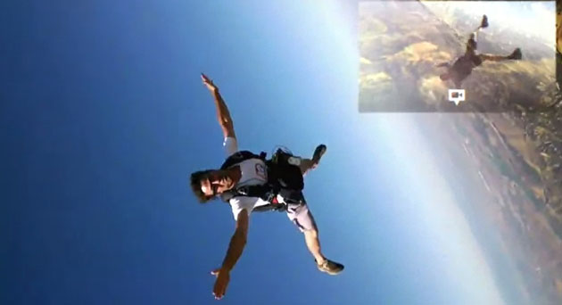
This underlying philosophy was there in the “One Day” video, but it reached new heights (literally) with the “How It Feels” video, where Google Glass users were shown recording video while sky diving (pictured above), performing on the trapeze, flying a jet plane, and ice skating. All the video needed was a Richard Wagener soundtrack. Will someone who lives a fascinating quiet life feel bad because she lacks the guts, the training, or the physical acumen to measure up to this? Will the quotidian life be discouraged in our culture? Will mean people use Google Glass videos to demean or humiliate those who don’t live these “larger” lives? How does it feel indeed to be on the other side of “How It Feels”?
ARGUMENT THIRTY
It will discourage people from striking up conversations with strangers.
Near the end of its run, the TV series Fringe depicted a future in which humanity was enslaved by pale men called the Observers. The Observers had the ability to read other people’s minds. (Ironically enough, they were also revealed to be technologically augmented versions of human beings.) In “The Bullet That Saved the World,” Peter enters a shop to purchase a necklace and, just as he’s striking up a conversation with the guy behind the counter, his experience is completely disrupted by an Observer who reveals exactly what Peter wants.
“It will look good on her,” continues the Observer. “The young blonde woman. What is baseball? You’re thinking of the Red Sox.”
Peter becomes understandably rankled. Of course, since the Observers control Earth, Peter can’t exactly kick the Observer’s ass.
Now human beings don’t have the ability to read minds. But the Observer here does sound an awful lot like a guy who has surgically implanted Google Glass into his skull. And Glass, as it stands right now, isn’t really that far away from this. Imagine some creep overhearing a conversation in a store and using the details he overhears to Google you on Glass. Because the conversationalists know they are being observed and they know that the creep can indite more data about you, the promising banter becomes stillborn.
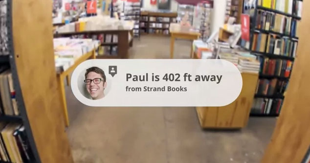
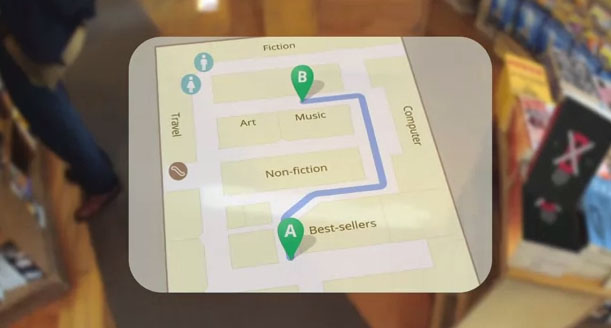
The “One Day” video prides itself on the user asking Google Glass, rather than a Strand Books employee, where the music section is in the store. As someone who has entered into several jocular conversations with the wonderful employees of the Strand (and who has been recommended interesting books and informed of news that I would never have thought to look up), the idea of abandoning that part of my life because a few insensitive technicians who aren’t even interested in books would rather spy on me fills me with the kind of violent fury I usually reserve for rapists, Jay Leno, and union busters.
ARGUMENT THIRTY-ONE
It could discourage companies from hiring people.
I’ve already touched upon needless prejudices against potential employees in Argument Three, but there’s another problematic future ahead for labor. When the national unemployment rate continues to hover around 8%, and well-qualified candidates are humiliated by an employer’s quest for perfection, companies could decide not to hire professional greeters or retail employees if they know that people can get the information for free through Google Glass. I’ve already discussed the assault upon conversations in Argument Thirty. But imagine the further erosion of customer service. What if you can’t have a face-to-face conversation with a store manager to get a refund or explain why a product is bad? What if you’re directed to a faceless form-style interface where not a single person can be held accountable? This will be bad for the future of labor and customer service.
ARGUMENT THIRTY-TWO
It will create unfair advantages for online retailers.
In late 2011, Amazon committed one of the most dastardly iron-to-the-knees acts in its history: it sent around a promotion link urging people to go into brick-and-mortar stores and scan books using a price check app, where the customer could then get a better deal at the online retailer. The novelist Richard Russo took to the New York Times:
The fickle gratitude of people who will have about as much loyalty to Amazon tomorrow as they do today to Barnes & Noble, last year’s bully? This is good business? Is it just me, or does it feel as if the Amazon brass decided to spend the holidays in the Caribbean and left in charge of the company a computer that’s fallen head over heels in love with its own algorithms?
The assaults on showrooming have been well documented. GetElastic’s Linda Bustos has pointed out how Google’s mobile Search app supports image capture search. Just like Amazon’s Price Check app, this means that if you aim the camera at a book’s barcode with your phone, Google Search will bring up an option to search Google Shopping or to view the book in Google Books. This also allows Google Search to produce the “nearby” vendor results so you can search for a better deal elsewhere. For struggling independent bookstores, a customer donning Google Glass with built-in ISBN capture search could be a greater threat than the Amazon Price Check contretemps. But if Glass users get more accustomed to using brick-and-mortar stores as a showroom for a purchase they can make online, this could have a devastating effect on retail outlets, especially the small ones.
ARGUMENT THIRTY-THREE
It could usher in a new form of vertical integration and that does not compensate talent.
In the early days of motion pictures, studios not only made all the movies, but they also owned most of the theaters. During the first half of the 20th century, there was a good chance that you frequented a house owned by a studio which played nothing but studio movies. This was one of the most famous examples of vertical integration, where a business controls both the suppliers and buyers. Adolph Zukor came up with the idea of block booking, which allowed Paramount to sell its films in packages. If a movie theater wanted a big ticket picture, then the theater would also have to buy countless dogs. This meant that studios could get away with flooding the theaters with inferior pictures and securing a market. Many independent producers couldn’t get their movies into theaters.
But United States v. Paramount Pictures, Inc. (1948) put a stop to this practice. The Supreme Court ordered studios to split their production and exhibition companies and/or sell off any theaters they owned. This resulted in many “art house” theaters filling screens with independent and foreign fare.
All this is happening again with Google. It is quite likely that you have a Gmail account, that you use Google to search the Internet, that you are using a smartphone running Android (an open-source operating system backed and owned by Google), and that you are uploading videos to YouTube. Google is so good at eluding antitrust charges that, only a few months ago, the Federal Trade Commission was forced to abandon a sweeping antitrust investigation after 18 months.
Perhaps what we’re really talking about is a new form of vertical integration. Google survives by controlling the services while its users create the content. Google will profit from Glass sales. It will rake in cash through advertising on the “theaters” it owns through YouTube. But Glass wearers are ultimately the ones who are generating these new movies. Don’t these new auteurs (or the random strangers who end up “starring” in these videos) deserve a take of the profits? While it’s true that YouTube extended revenue sharing to viral videos a few years ago and that the “Charlie Bit My Finger” video earned Howard Davies-Carr more than $158,000, one must legitimately ask if this is enough reimbursement for a video that has been viewed half a billion times. Or how about Psy’s “Gangnam Style”? Is $870,000 fair compensation for a video seen by nearly 1.5 billion people? (To get a real sense of how YouTube cheaps out, consider that Robert Downey, Jr. earned more than $50 million for The Avengers, which has grossed $1.5 billion worldwide.)
YouTube is clearly underpaying its talent. And Google hasn’t exactly been forthcoming about how much it collects from a viral video. But YouTube did make $50 billion in revenue last year, or more than 33 times the total gross on The Avengers. The irony here is that Hollywood has been more munificent towards its talent than Google. Hollywood has to pay scale. Why shouldn’t Google?
We can expect more of the same stinginess with Glass as more viral video stars are proliferated and Google rakes in a greater share than it deserves.

ARGUMENT THIRTY-FOUR
It will make driving dangerous.
In 2011, the Governors Highway Safety Association conducted a study revealing that smartphones were responsible for 15 to 25% of all traffic accidents. Yet David Pogue — arguably the most unimpeachable journalist who has ever worked at The New York Times — was quick to point out that “the tiny screen is completely invisible when you’re talking or driving or reading.” But will Google Glass have something akin to an airplane mode for these activities? Indeed, why does one need to wear the glasses all the time? Would not a driver have a temptation to chat with a friend while driving? And could that continuous partial attention cause more collisions?
ARGUMENT THIRTY-FIVE
It could attempt to erase people in need from existence, as well as serious problems that we cannot ignore.
Ayesha – TV Interview with Brian Lehrer from Hybrid Reality on Vimeo.
There was another helpful lead buried in Morozov’s New York Times essay, and it came from Ayesha Khanna. In the above interview with Brian Lehrer, Khanna identifies the forthcoming period of human history as “a hybrid age”:
The idea is that reality is no longer dominated by humans, but now we coexist with technology. Every single action, even emotional relationships that we have, are going to be mediated by technology. Let’s talk about a couple of examples. One example is augmented reality. Augmented reality allows you to have software that superimposes information on objects that you see. So if you take a camera of the Eiffel Tower, it will actually give you information of the history of the Eiffel Tower. Now in Germany, they’ve devised software that will actually allow you to delete that information as well. So if you decide you don’t like homeless people in your city, and you use this software and implant it in your contact lenses, then you won’t see them at all. So now we have enhanced our basic sense by using technology.
There is nothing “enhanced” at all in pretending that a homeless person doesn’t exist. It is bad enough that many of us live out our lives often pretending that a bedraggled man desperate for help and approaching us for spare change is invisible, but imagine a piece of software that would erase the homeless from your perceptual existence. I cannot think of a more inhumane and crassly automatic manner of living. What if Google (or some other authority) decided that other people or other viewpoints that we needed to hear should be erased? Is this really a life that we want mediated by technology? Morozov identifies this pathology as “solutionism,” whereby problems are solved in a pristine and roseate technological haze.
This sounds an awful lot like Jane McGonigal’s remarkably naive and insensitive vision of a world rooted around gamification, which I strongly condemned in a January 2011 essay. Judging from the early apps revealed at South by Southwest, Glass’s emphasis will revolve around the constant confirmation of one’s saccharine existence. In a story filed on March 11, 2013, Google “developer advocate” Timothy Jordan raved to The Verge about Path, an application that will flummox you with endless affirmation. “Path sends me pictures from the people I know really well and the people that I love,” gushes Jordan. “I can tap on any one of them to comment or choose an emoticon without breaking my stride.”
But what about the people you don’t know very well and need to learn from? Why the need for childish stimulation and constant multitasking? I’d like to see smug bastard select an emoticon without breaking his stride during an evening walk through northeast Detroit. That is, if he bothers to notice or give a damn about the very real people surviving near the edge of 8 Mile Road.
“This is a day I’ve been looking forward to for two and a half years. Every once in a while, a revolutionary product comes along that changes everything.” — Steve Jobs, January 9, 2007
When Steve Jobs unveiled the iPhone six years ago, he ignited a true revolution. He took three separate ideas (“Widespread iPod with touch controls,” “revolutionary mobile phone,” and “breakthrough Internet communicator”) and merged them into one device. Watching Jobs’s Macworld 2007 keynote today, it’s spellbinding to see Jobs place the iPhone into Apple’s legacy, demonstrate a clear historical trajectory of progressive invention, and clearly delineate how other competitors have gone wrong. Most importantly, everyone watching Jobs’s speech knows they can be a part of this revolution. Jobs is a digital Henry V rallying his troops. It’s San Francisco’s answer to St. Crispin’s Day. But in order to change the world, Jobs had to push his engineers to their breaking points, remain fastidious beyond reason on the design details, anticipate all problems in advance, and truly empower his consumers in terms they could easily understand.
Sergey Brin wants to change the world, but he doesn’t share any of these qualities. He is an unrehearsed man, awkward before a crowd, who invites nervousness rather than awe. He cannot explain in cogent terms how Glass can and should alter your life. What is Glass’s answer to Multi-Touch? What is Glass’s revolutionary UI? The fact that you can wear it? In his 2007 keynote address, Jobs articulated ten very specific iPhone functions that everyone could use. But in 2012, Brin warbled before the crowd, with a bunch of skydiving pals beaming back video on a screen in an auditorium. Jobs didn’t need skydivers and guys on mountain bikes to sell the iPhone. The proof was in the concept.
The difference here is palpable: Jobs believed that the iPhone was for everyone. For Brin, Glass is for a privileged elite. But if you want to start a revolution, then you need to know how to speak and appeal to the people. And you should really work out the kinks before you speak out.